Go to content

Formue

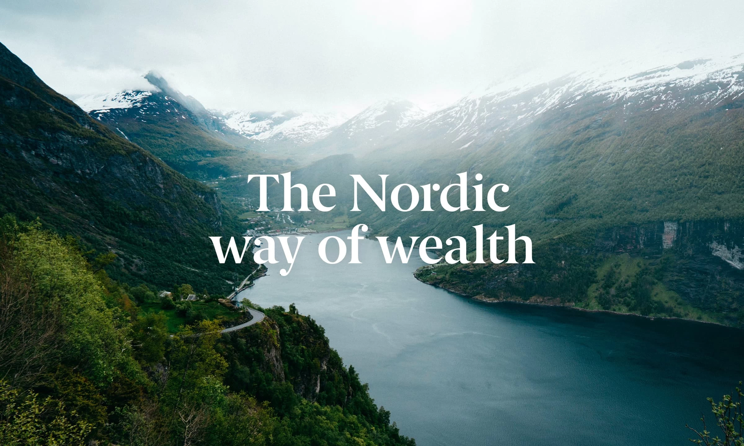
The Nordic way of wealth

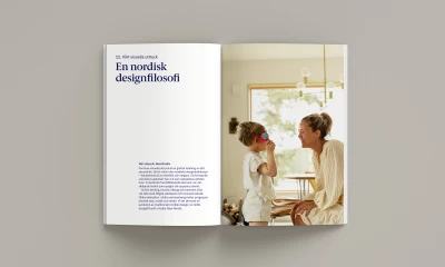
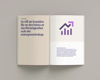
Formue (previously Burenstam & Partners) is a leading company for independent advisory services for wealthy individuals and families. Formue is a Nordic word that means ‘wealth’ and ‘ability’. The company believes that there is a story behind every fortune and that great potential lies in it. They help and support clients to bring out that potential so that they can experience richer lives. Not just monetarily but also from a qualitative perspective.

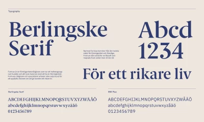
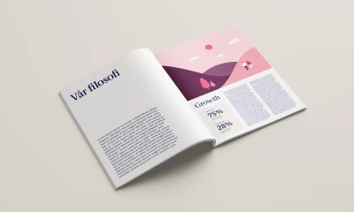
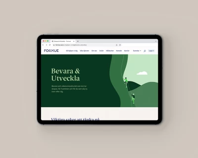
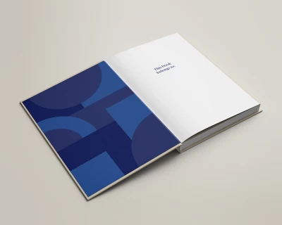
Grand Public has contributed with brand strategic consultation and finalization of the brand identity by refining the graphic toolbox, tonality, signage, and animations. We've also created communication material for internal and external use.

Logo

The core of the updated brand identity is the refined logotype built on geometrical shapes. We gave the wordmark a careful and considered refresh with balanced and proportional, yet playful, features. We also made the wordmark come to life by adding motion.

Color

Grand Public revised the color palette and provided strategic guidance for color use throughout the visual identity. Our methods tied the visual expression closer to the defined design philosophy and resulted in stronger brand recognition.

Typefaces

By adding a new headline font, we gave Formue a premium and sophisticated typographic look that harmonizes with the new logotype. The well-crafted typeface Berlingske Serif by the Copenhagen based foundry Playtype provides a voice suitable for a wide range of topics, from strict econmical facts to emotional human values.

Illustration style

The brand illustrations adds a spark of energy to the Formue brand. Grand Public refreshed the illustration style with a soft, calm, and contemporary expression. We also provided two different modes – Light mode and Dark mode, to enable a wider range of use.

Need to set strategies for a new or existing brand? Ingrid would love to talk to you about our services.

Contact Ingrid

See more of our work

Go to Family Business Network

FBN / Sveriges familjeföretagare

Digital Development Brand Design Brand Strategy

A source of knowledge and voice in society for business families

Go to Snif Half baked Harvest

Snif

Packaging Design Communication Design

Tieghan Gerard – Half Baked Pumpkin Smash

Sorry, this website uses features that your browser doesn’t support.

Upgrade to a newer version of Firefox, Chrome, Safari, or Edge and you’ll be able to visit the website.