Go to content

Newsec

The power of perspective

Newsec is a leading services company in real estate, with a wide range of services across real estate and renewable energy. The company was founded in 1994 and is now a partner-owned company with 2 000 co-workers in seven markets and ambitious plans to continue expansion. They wanted to strengthen the brand to attract the right talent and investors and cement associations around high-quality service delivery and a strong entrepreneurial mindset to support their efforts.

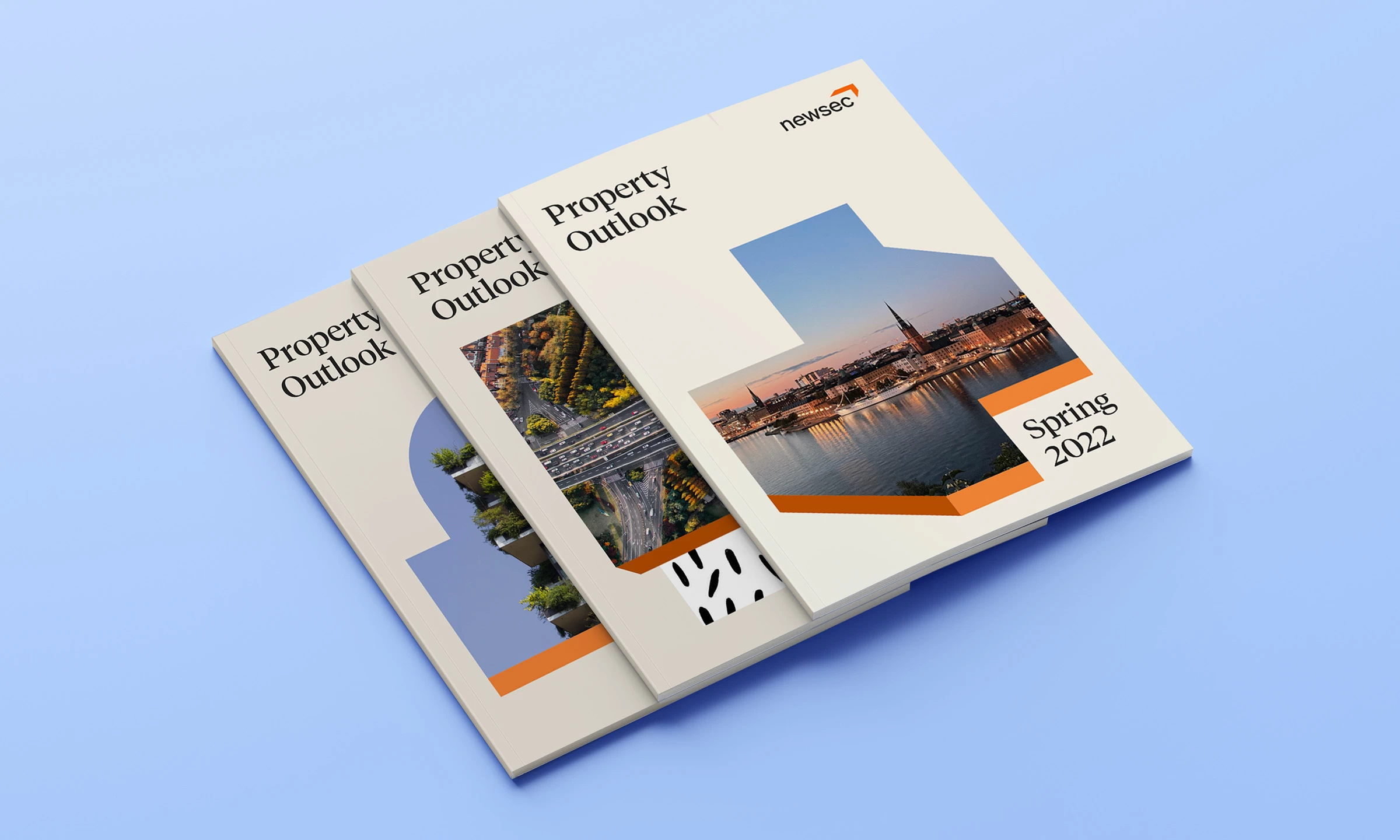
After conducting several workshops and interviews, a competitive analysis and a brand position were developed around the concept of ’the power of perspective. The visual identity was built from that strategy, bringing to life the different perspectives Newsec uncovers and the growth it creates for its clients. The identity work was developed to be relevant for many years and highly adapted for a digital arena.

Logo

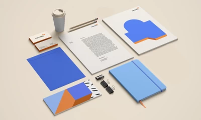
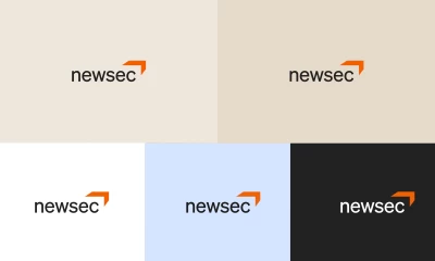
We updated the Newsec logo to add flexibility and conceptual characteristic and transformed the previous box shape into a forward-facing, dimensional symbol. The wordmark was set in sans-serif with an even height for a smooth appearance.

Shapes

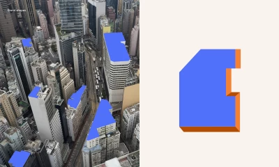
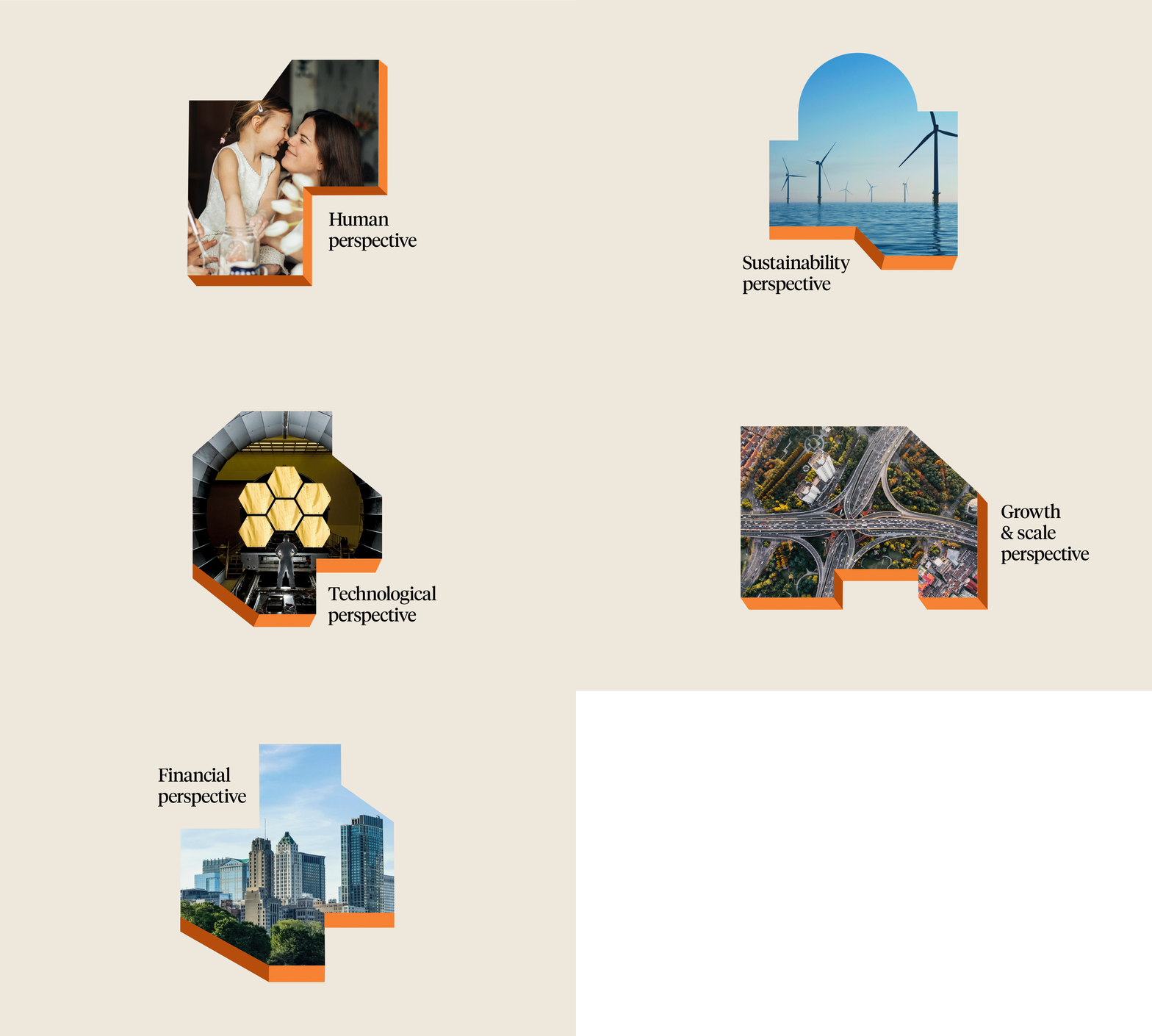
Grand Public has added a toolbox of shapes inspired by cityscapes from above. The forms are three-dimensional to highlight perspectives, and the content within represents the large perspectives inspired by society, globalism, and infrastructure. The shapes can be combined with hand-drawn, organic patterns to achieve a playful and humanist look.

Colour

The new color palette combines soft, warm Scandinavian sand tones with intense blue colors. Blue represents calm and safety and adding light hues also creates a feeling of optimism, youth, and new visions. A vivid orange accents the palette and is a complementary color to blue. The orange brings energy and warmth to the palette.

Want your brand to look good and attract talent? Ingrid would love to talk to you.

Contact Ingrid

See more of our work

Go to Snif – Suganami

Snif

Product Design Communication Design

Smooth and genderless on the inside, eco-conscious on the outside

Go to Snif Half baked Harvest

Snif

Communication Design Packaging Design

Tieghan Gerard – Half Baked Pumpkin Smash

Sorry, this website uses features that your browser doesn’t support.

Upgrade to a newer version of Firefox, Chrome, Safari, or Edge and you’ll be able to visit the website.